
The Power of Visual Metrics in Data Dashboards
Data without context is just numbers. The real magic happens when you transform those numbers into visual insights that tell a compelling story. Looker Studio (formerly Google Data Studio) offers powerful tools to turn your raw data into visually appealing, insightful dashboards that drive better business decisions.
Spoiler Alert: Creating dashboards is just the beginning. Dashboards can help you uncover trends and craft insights, turning them into stories that ignite action. We’ll cover that next.
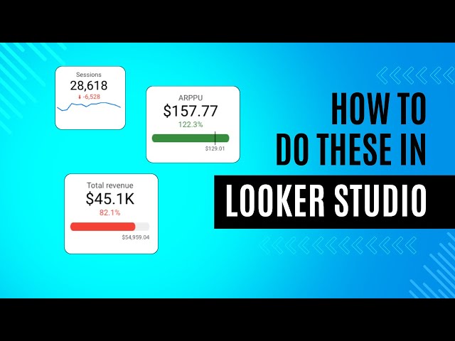
In this guide, I’ll walk you through adding four key elements that will take your dashboards from basic to brilliant: metrics, KPIs, sparklines, and comparisons. These features not only make your dashboards more visually engaging but also significantly enhance their analytical value.
Getting Started with Scorecard Metrics
The foundation of any effective dashboard is clear, easy-to-read metrics. Scorecards are perfect for this purpose.
How to Add a Basic Scorecard to Your Dashboard:
- Click the “Add a chart” button
- Select “Scorecard” from the menu
- Choose your data source and the metric you want to display
A basic scorecard will show you a single number, but its real power comes from customization. You can adjust the formatting to make the metric instantly understandable:
- Number formatting: Change to percentage, currency, or custom formats
- Color themes: Use brand colors or conditional formatting
- Text styling: Adjust size and font to emphasize important metrics
Pro tip: Keep your scorecards simple and focused. Each scorecard should communicate a single, clear insight at a glance.
Elevating Metrics to KPIs with Comparisons
A metric becomes a Key Performance Indicator (KPI) when it measures progress toward a specific goal or compares current performance to a previous period.
Adding Comparison Metrics:
- Select your scorecard
- In the properties panel, find the “Comparison” section
- Choose a comparison type (previous period, year-over-year, target value)
- Select how to display the comparison (absolute value or percentage)
This small addition transforms a static number into a dynamic indicator of performance. The comparison automatically includes an up or down arrow, which you can customize to show whether an increase is good (green) or bad (red) depending on the metric.
When to use comparison metrics:
- Revenue (up is good)
- Conversion rates (up is good)
- Bounce rates (down is good)
- Cost per acquisition (down is good)
Adding Sparklines for Trend Visualization
Sparklines are compact, word-sized charts that show trends over time without taking up much space. They’re perfect for dashboards where real estate is limited but you still want to provide context.
How to Add Sparklines to Your Scorecard:
- Select your scorecard
- In the properties panel, find the “Sparkline” option and enable it
- Choose the time period for your sparkline
- Adjust the color and style settings
Sparklines add valuable context by showing how a metric has been trending over days, weeks, or months. This helps dashboard users understand not just the current value but its movement over time.
Best practices for sparklines:
- Use them for time-series data only
- Keep the time period consistent across related metrics
- Use color to highlight significant changes or trends
Creating Powerful Time Comparisons
Time comparisons allow you to analyze how your metrics have changed over specific periods, giving you insights into seasonal patterns, growth trends, or the impact of specific campaigns.
Setting Up Time Comparisons:
- Click on “Resource” in the top menu
- Select “Date range”
- Enable “Compare dates”
- Choose your comparison period (previous period, same period last year, etc.)
Once enabled, this feature will apply to all date-aware visualizations in your Looker Studio dashboard, showing both current and comparison period data.
For more specific comparisons on individual charts:
- Select the chart you want to add a comparison to
- Go to the “Data” tab in the properties panel
- Add a second date range dimension
- Customize how the comparison appears
Advanced Techniques for Metric Visualization
Once you’ve mastered the basics, consider these advanced techniques:
Using Calculated Fields for Custom Metrics
- Click “Resource” then “Manage calculated fields”
- Create formulas that combine existing metrics
- Use these in your scorecards for custom KPIs
For example, you might create a calculated field in Looker Studio. In our example we can use the available fields to calculate profit margin like: `(SUM(Revenue) – SUM(Cost))/SUM(Revenue)`
Creating KPI Gauges
For metrics with specific targets:
- Add a gauge chart instead of a scorecard
- Set minimum, maximum, and target values
- Customize the color ranges to show performance zones
Building a Metric Hierarchy
Organize your metrics in a logical hierarchy:
- Top level: 3-5 primary KPIs
- Second level: Supporting metrics that influence primary KPIs
- Detailed level: Granular metrics for deep analysis
Bringing It All Together
The most effective dashboards combine these elements strategically. Here’s a sample layout:
- Header section: Primary KPIs with comparisons to previous periods
- Trend section: Key metrics with sparklines showing movement over time
- Detail section: Breakdowns of metrics by segment, channel, or other dimensions
Remember that the goal isn’t to add as many metrics as possible, but to present the most relevant data in the most insightful way.
Final Tips for Dashboard Excellence
- Maintain consistency: Use the same comparison periods and formatting across related metrics
- Provide context: Add text boxes explaining what the metrics mean and why they matter
- Focus on actionability: Every metric should help answer the question, “What should we do next?”
- Refresh regularly: Set up automatic data refreshes to keep your dashboard current
By thoughtfully implementing metrics, KPIs, sparklines, and comparisons in your Looker Studio dashboard, you’ll create a powerful tool that not only visualizes data but generates actionable insights that drive better business decisions.
What metrics are most important for your business, and how could better visualizations help you understand them? Start building your enhanced dashboard today and watch how much clearer your data story becomes.