
Pie charts are usually not liked by analysts for a good reason. We’ll cover the reason in the details, but first, let me give you what the title suggests: “Pie Charts in Looker Studio.”
Trying to create a pie chart in Looker Studio for the first time can be daunting; you can immediately feel something is off if any configuration goes out of control. What seemed like a simple visualization can turn into hours of frustration as you click through menus trying to make sense of it all. Luckily, these charts can be built in minutes. Let me share what I’ve learned about creating effective pie charts in Looker Studio that actually tell a story with your GA4 data.
Why Pie Charts Matter in Analytics Reporting
Pie charts work wonders when we need to show how different parts contribute to a whole.
The beauty of pie charts is their simplicity. Even team members who get nervous around data can understand “the blue slice is bigger than the red slice” without any explanation if the difference between slices is meaningfully different. By now, you already understand why pie charts are not used once possible.
Getting Started: Connecting GA4 to Looker Studio
Before making any charts, you need to connect your GA4 data to Looker Studio. This is simpler than you might expect if you have never done it before:
- Go to Looker Studio (lookerstudio.google.com) and click “Create”
- Select “Data Source” and choose “Google Analytics 4”
- Pick the GA4 property you want to use
- After authorizing access, your data appeared ready to use
The connection stays live, so your dashboards always show current data.
Creating Your First Pie Chart
Once connected, you can create your first pie chart by:
- Clicking “Add a chart” from the top menu
- Selecting the pie chart icon
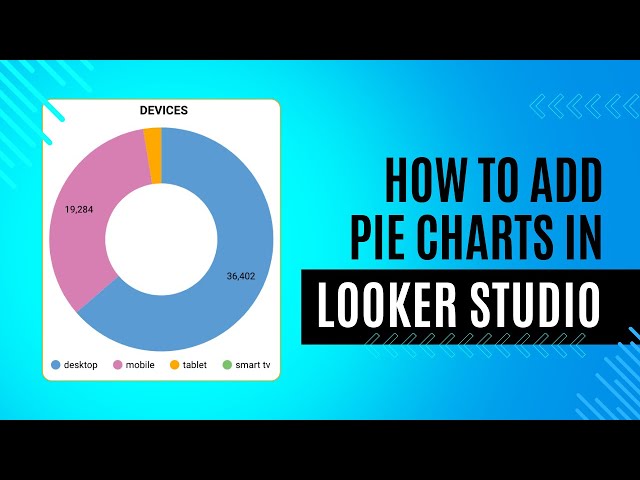
- Setting your dimension (what you want to split into slices) – for example, “Traffic Source”
- Choosing your metric (what determines slice size) – typically “Users” or “Sessions”
At first, the charts may appear dull with their default colors and lack of context, which quickly highlights the importance of customization.
Making Pie Charts Actually Useful
Use Filters Strategically
Most likely, you want to analyze a specific time period; unless you select a desired time period, charts may show ALL data, making them cluttered and confusing. Adding date range filters lets you focus on specific time periods. You can also add segment filters, allowing the team to quickly switch between viewing mobile users versus desktop users or new versus returning visitors.
Limit Your Slices
The most common mistake is trying to show too much. A pie chart with 15 tiny slices just creates confusion. You can limit my charts to 5-7 slices maximum, using an “Other” category to group smaller segments together.
Add Context with Comparison Data
Adding a summary metric beside pie charts, like showing the total number, gives viewers context about whether we’re looking at hundreds or millions of users.
Solving Common Problems
Problem: Too Many Tiny Slices
To prevent seeing too many slides, you can work with dimensions/categories that don’t have many values, for example, Device Category, Gender, and Age are good selections. If you are analyzing page views, you can end up with dozens of pages creating tiny, unreadable slices. You fixed this by:
- Creating a calculated field that grouped everything except your top 5 pages
- Using this new dimension instead of the raw page path
- OR not using high-value dimensions with pie charts. They can be better suited with tables.
Problem: Confusing Labels
The default labels in Looker Studio sometimes show strange formatting. You can customize them to show both the category name and percentage, making the chart immediately understandable.
Problem: Ugly Colors
The default colors may not match your brand, and some may be hard to distinguish. You can create a custom color palette matching your company colors, which can make your dashboards look professional and on-brand.
Beyond Basic Pie Charts
As you get more comfortable, you can start enhancing your dashboards:
- Adding donut charts (pie charts with a hole) to fit more charts in the same space
- Creating multiple pie charts side by side to compare different metrics
- Adding interactivity so clicking a slice filtered other charts on the dashboard
What I Wish I’d Known Earlier
Looking back, it could be great to know the things below to reduce the trial and error, which is, by the way, inevitable and a part of the progress:
- Pie charts work best for showing 3-7 categories at most
- Always include clear labels with percentages
- Consider using a bar chart instead if precise comparisons are needed
- Take time to adjust colors for better contrast and readability
Final Thoughts
Mastering charts in Looker Studio transformed how I report GA4 or any dataset to my team. What used to be boring spreadsheets became visual stories that drive decisions. The learning curve may be steeper than expected, but the impact on how your team understands data made it completely worthwhile.
If you’re just starting with Looker Studio and GA4, focus on creating simple, clean visualizations that answer specific questions. Your colleagues will thank you for making complex data easy to understand, and you’ll spend less time explaining reports and more time acting on insights.
What visualization challenges are you facing with your analytics data? I’d love to hear about them!
Keep analyzing and helping your teams to make data-informed decisions!